Tatler+
During this virtual talk held at the Roche Bobois Singapore showroom, Design Intervention shares more about the uplifting effects of colour—watch the full discussion here.
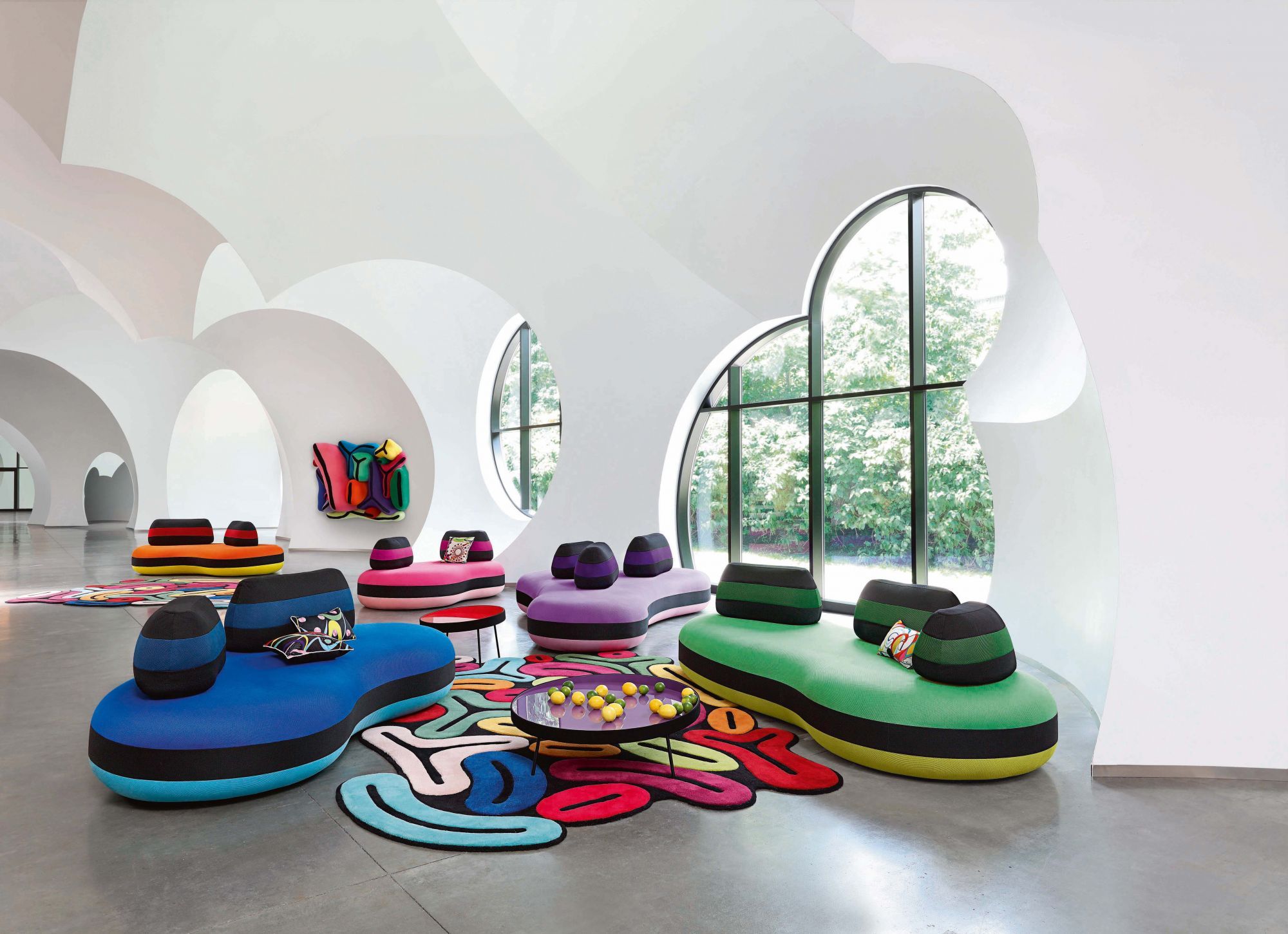
Colour plays a huge role in any design. A universal visual language, colour holds the ability to alter and influence one’s mood.
To better understand the flair and craft of using vibrant hues and patterns, Tatler Homes Singapore and French furniture brand Roche Bobois co-hosted a virtual event with Design Intervention’s founder Nikki Hunt and co-CEO Andrea Savage. Known for their savvy ability to inject colour seamlessly into spaces, this latest edition of Tatler Talks delved into the significance of colour with the two experts.

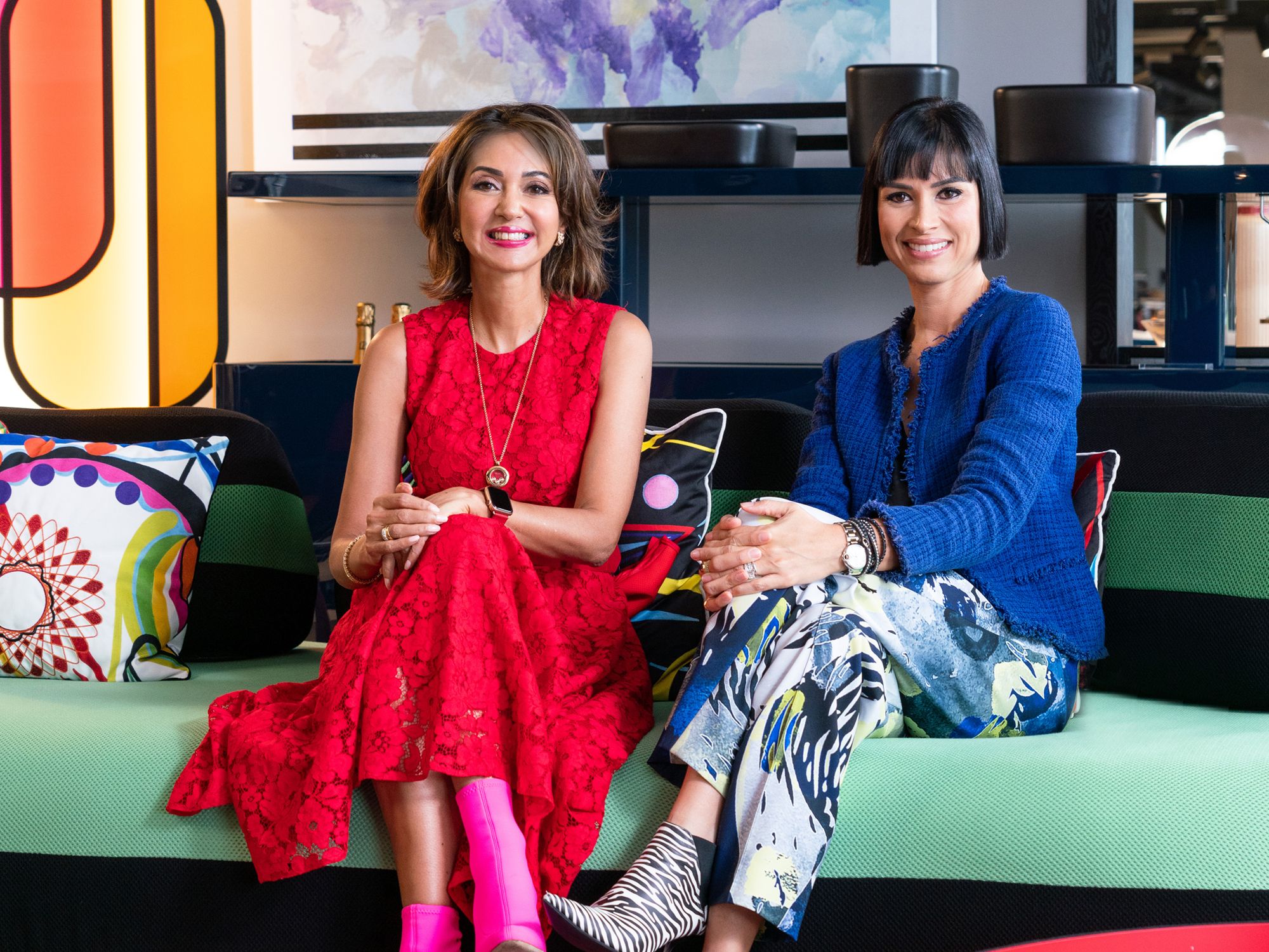
Moderated by Kissa Castañeda, Tatler Asia’s editorial director for homes and travel, the virtual talk was held at the Roche Bobois Singapore showroom and was broadcasted via Zoom.
“Colour is one of our favourite tools to use to craft a space,” Hunt remarks. “Now, more than ever before, if we’re having those horrible days where we’ve been stuck in traffic or we’ve had an argument with a friend; we want to come home, shut that door on the outside world and have our own sanctuary. Colour, space and light are all design tools.”
Below, we share the key takeaways and tips from these seasoned designers.