Citrona, a soft lemon shade, was created by Kelly Wearstler who was inspired by Californian lemon trees (Image: Farrow & Ball)
Cover Citrona, a soft lemon shade, was created by Kelly Wearstler who was inspired by Californian lemon trees (Image: Farrow & Ball)

Elevate your home’s colour scheme with a fresh coat of paint, whether it’s a comforting earthy brown or a sophisticated violet

No one can deny the transformative power of colour. Take, for example, the Californian-inspired paint colour, Citrona from the Farrow & Ball and Kelly Wearstler collection—a cheerful yellow hue that radiates energy and brightens up any room instantaneously.    

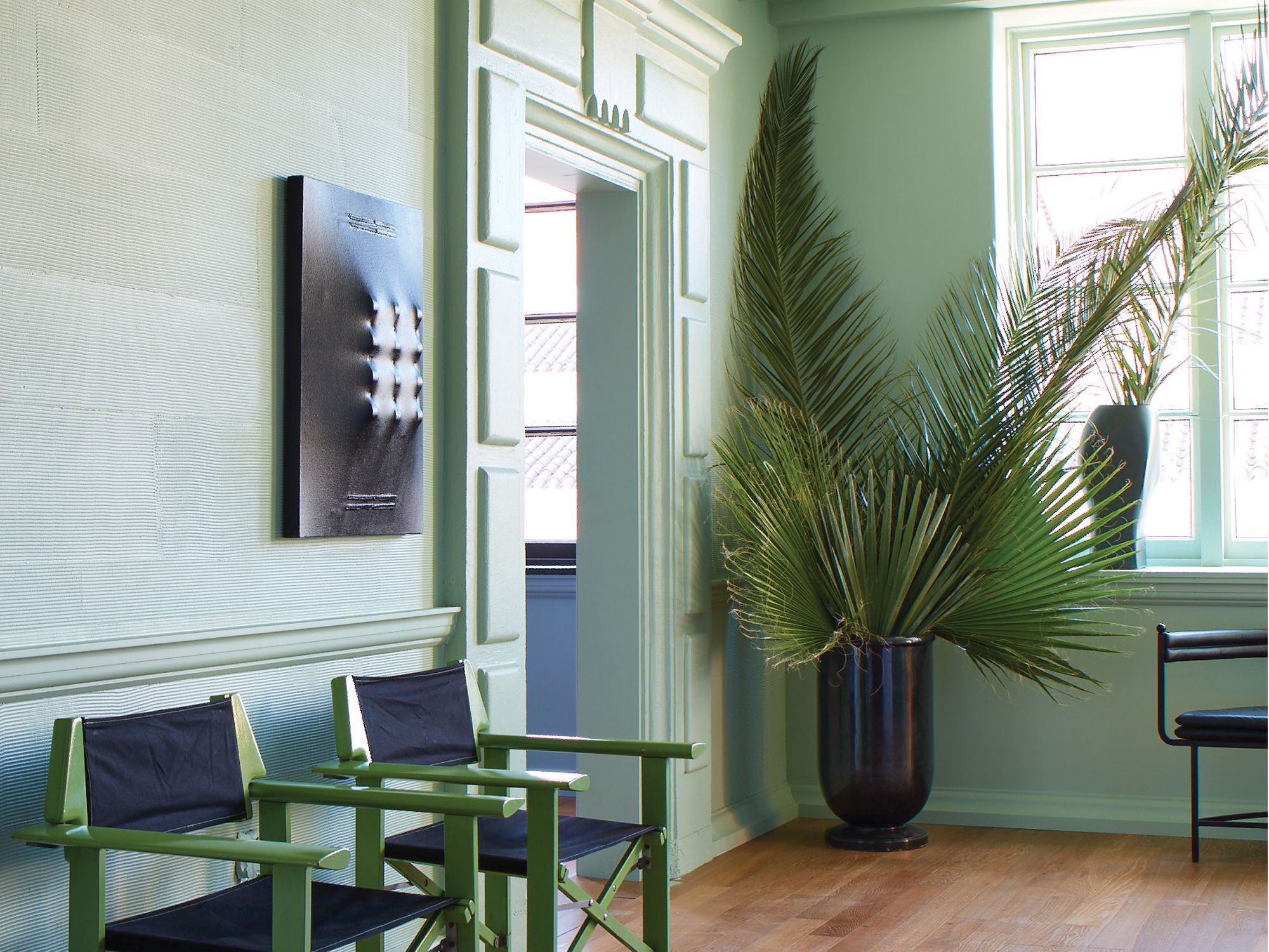
If you’re thinking of applying a new coat of paint to your walls, many major paint companies have announced their top colour trends alongside their new paint collections. Get inspired by these popular paint hues to refresh your interior for the year ahead.

See also: 17 Ways To Decorate With The Pantone Colour of the Year 2021

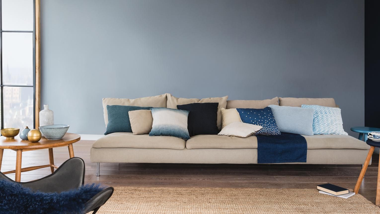
1. Walking Tall from Nippon Paint

Paint company Nippon Paint has paired up with renowned feng shui extraordinaire Hillary Phang to gather the most prosperous colours according to each zodiac sign. 

Those born in the Year of the Ox, for example, will find that one of their colours of fortune is a light, calming blue (Walking Tall). As health is a major priority for oxen this year, the pale and peaceful blue hue might help alleviate stress and reduce anxiety.  

2. Light Cadence from Nippon Paint

An alternative prosperous colour those born in the Year of the Ox is Light Cadence, a soft violet hue. The purple shade is said to promote harmony and wisdom, while also stimulating creative energy. Mix and match between several of your auspicious colours to find the best combination that will invigorate you.

See also: 5 Expert Tips on How to Create Good Feng Shui in the Year of the Ox

3. Faded Terracotta from Farrow & Ball

Tatler Asia
Kelly Wearstler in a room awash with Faded Terracotta, a soft and warm reddish hue (Photography: Joyce Park)
Above Kelly Wearstler in a room awash with Faded Terracotta, a soft and warm reddish hue (Photography: Joyce Park)

British paint company Farrow & Ball has teamed up with the celebrated American designer Kelly Wearstler to launch eight fresh signature shades. Wearstler, known for her playful and maximalist design approach, is the brand’s first partnership with a celebrity designer since its founding in 1946. 

The Californian native drew inspiration from her hometown when creating the colour palette. Aptly titled The California Collection, the various versatile shades include a warm peach tone. Named Faded Terracotta, the cosy colour is contemporary and motivating; the pale hue allows for a monochromatic scheme without feeling too overwhelming. 

4. Palm from Farrow & Ball

Tatler Asia
Palm, a fresh green shade from the California Collection by Farrow & Ball and Kelly Wearstler (Image: Farrow & Ball)
Above Palm, a fresh green shade from the California Collection by Farrow & Ball and Kelly Wearstler (Image: Farrow & Ball)
Tatler Asia
Kelly Wearstler with different shades of the California Collection by Farrow & Ball and Kelly Wearstler (Photography: Joyce Park)
Above Kelly Wearstler with different shades of the California Collection by Farrow & Ball and Kelly Wearstler (Photography: Joyce Park)

Another key hue from the California collection by Farrow & Ball and Kelly Wearstler is Palm, a pistachio ice cream green. The minty colour is Wearstler's take on the iconic Californian palm trees, with a desaturated quality.

“I always say living without colour is like living without love, so it’s been a dream to partner with Farrow & Ball on a collection of paint colours that celebrates the emotions (that) colour can evoke,” Wearstler shares. “Colour is the spirit of a room, and provides expressive power to transform a space with your personal voice, whether you’re painting all of your walls, or just one.

See also: 5 Colourful Bedrooms that are Decor Goals

5. Terra from Gush

Homegrown paint manufacturer Gush selected Terra as their pick for colour of the year. A rich and dynamic brownish-red, the warm hue serves to spark passion and stimulate creativity. The shade is therefore an idyllic selection for study rooms, or even as an accent wall in dining spaces where the vibrant colour will help whet appetites. 

The mellow reddish paint is part of the brand’s specially formulated cair interior paint. Innovated in Singapore, the odourless paint has air-purifying, anti-moulding and anti-bacterial features; this allows you to safely give your walls a fresh new colour without breathing in toxic fumes. 

See also: 10 Red Furniture Pieces And Decor Items That Make Great Accent Pieces

6. Brave Ground from Dulux

Tatler Asia
Dulux's Colour of the Year in 2021 is a grounding brown hue (Image: Dulux)
Above Dulux's Colour of the Year in 2021 is a grounding brown hue (Image: Dulux)

Dulux’s colour of the year, Brave Ground, is a natural, earthy shade that exudes stability and strength. Warm and reassuring, the versatile shade offers a firm foundation for courage, change and creativity. 

“The movement towards brown now is that it’s providing a home foundation,” says Andrea Savage, co-CEO of Design Intervention. The Singapore-based firm Design Intervention was part of the panel in choosing this year’s Colour of the Year. “It’s giving you that support and renewal, so you feel that you can open the front door and go on to face the world. Brown has taken on a completely different philosophy, (not just on) the sustainability aspect.”

7. Denim Drift from Dulux

Tatler Asia
Denim Drift, Dulux's Colour of the Year in 2017, is a classic and versatile colour that's consistently popular on social media (Image: Dulux)
Above Denim Drift, Dulux's Colour of the Year in 2017, is a classic and versatile colour that's consistently popular on social media (Image: Dulux)

Another popular hue from Dulux is Denim Drift, a calm shade of blue that brings a sense of peace and tranquillity. Experts at Homehow have identified it to be one of the most consistently favoured paint colours on Instagram. Alex Willcocks, Director of Burbeck Interiors, explains, “It’s popular because it is incredibly versatile and can be styled and accessorised in many ways. It’s a fun colour and can be utilised in any room to add personality.”

See also: Tatler Talks: How Colour can Improve Your Home Design and Well-being

8. Aegean Teal 2136-40 from Benjamin Moore

Tatler Asia
Aegean Teal is a soothing and peaceful shade that makes for an elegant interior (Image: Benjamin Moore)
Above Aegean Teal is a soothing and peaceful shade that makes for an elegant interior (Image: Benjamin Moore)

Benjamin Moore colour of the year for 2021 is Aegean Teal 2136-40—a rejuvenating shade of blue-green with undertones of grey. The soothing paint colour promotes harmony and leisure; it’s an alluring shade that invites one to rest and relax. With its peaceful qualities, the colour is an ideal option for bedrooms or home offices.

Accompanying the teal shade are 11 other hues from Benjamin Moore's 2021 colour trends palette. Ranging from soft buttery shades of yellow to creamy off-whites, the colours in the collection work to complement and enhance the trending teal hue.

Topics